memes.cjtrowbridge.com
Category: Anti-Capitalism - Housing -> This Meme
llama-3.2-vision
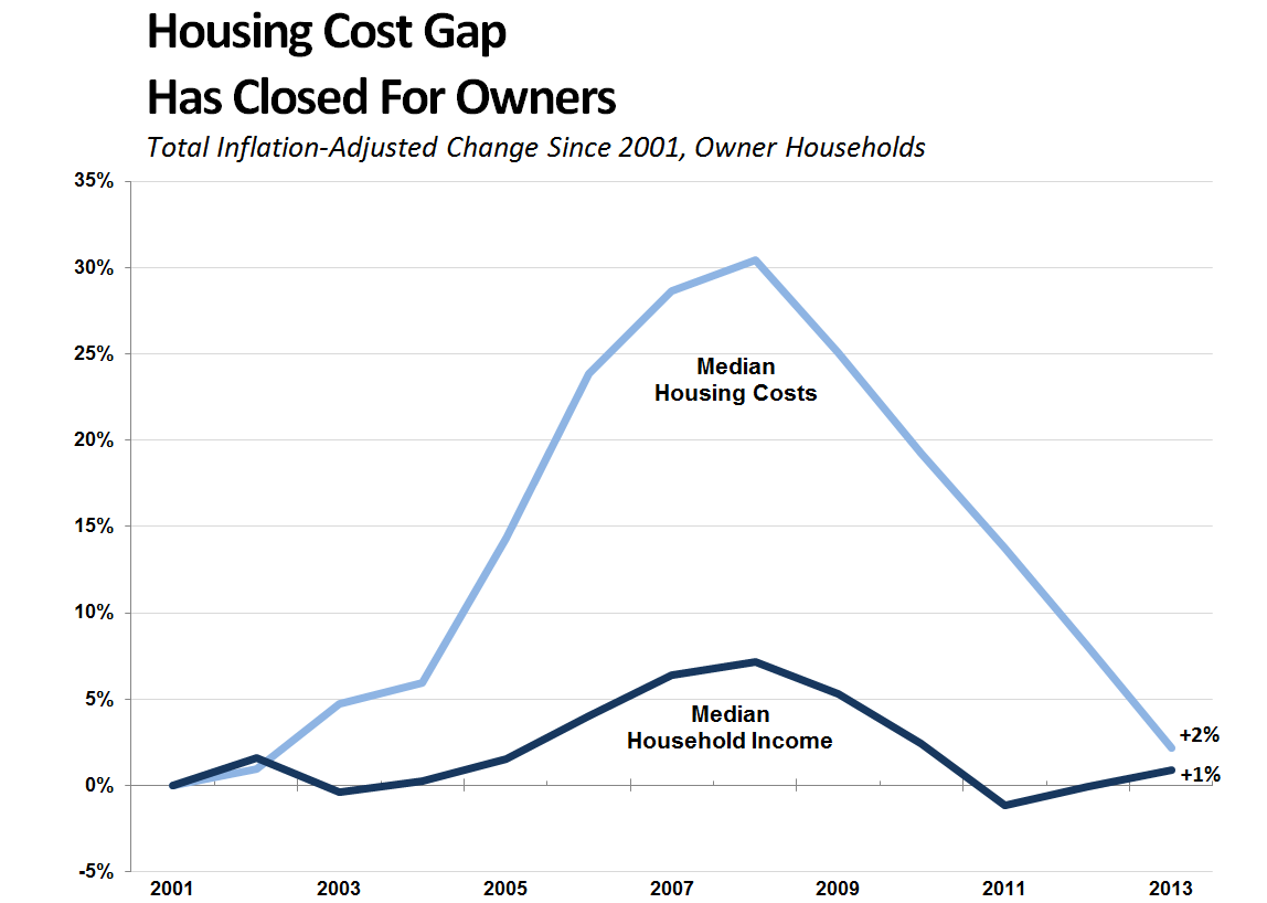
The meme is a graph showing the relationship between the inflation-adjusted change in median household income and the median household income since 1997. The graph has a dramatic spike in 2008, followed by a sharp decline, and then a steady increase. The text "2008" is written in the bottom right corner of the graph, but the rest of the text is not visible.
first-seen
2023-09-16T01:07:13+00:00
tesseract
Housing Cost Gap Has Closed For Owners Total Inflation-Adjusted Change Since 2001, Owner Households 35% 30% 28% Median Housing Costs 20% 15% 10% % Median Household Income 42% 0% ——“ eae 5% 2001 2003 2005 2007 2009 2011 2013